AKI APP DESIGN
RESPONSIBILITIES
UI
UX
PRODUCT DESIGN
BRANDING
ART DIRECTION
DELIVERABLES
APPLICATION
SCROLL
INTRO
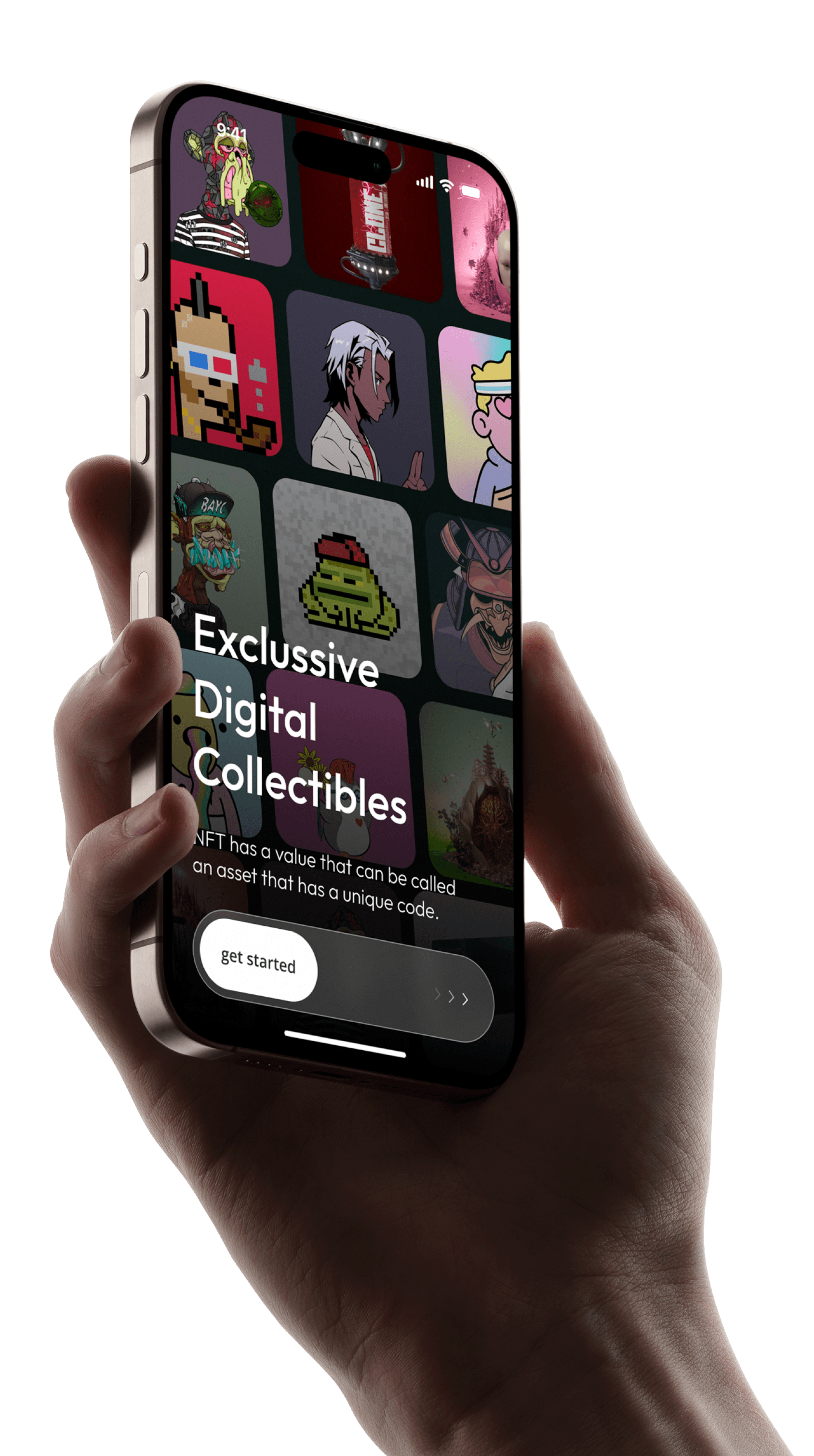
AKI is a Web3 App focused on NFT news, trading, airdrops, and rewards.
User demand highlights the need for a mobile app to boost engagement and revenue.
PROCESS
Target Users
NFT-savvy youth aged 20-35 who embrace new concepts; Youthful design preferred.
Design Direction
Differentiation
Unique design elements distinguish us from competitors, creating distinctive brand identity.
Simplicity
Clean layouts, intuitive labels and minimal visual noise enhance usability by streamlining navigation and operations.
Responsiveness
Deliver consistent, high-quality UX across devices with fast-loading modules for optimal performance.

FRAME LESS, DELIVER MORE
Cards replace lines. Hierarchy stays clear
ethink structure. Let NFT visuals speak. Every pixel focused on what matters—the digital art.
Colorless by design
When every pixel of your NFT matters, step back and pure black, white, and gray—so art speaks loudest.
Dimensions, reimagined
Every pixel counts in NFT discovery. Horizontal scroll unlocks new canvases—letting banners breathe while feeds flow seamlessly.


Round

Type & Icons. Perfectly in sync
Rounded lines meet soft curves.
Every stroke shares the same gentle radius—for harmony that feels effortless.
about us
About us
Lowercase by design
Thoughtfully crafted for the younger generation.
Softer curves. Better flow. Perfect harmony between type and icon.
Seamless curves. Effortless flow
Every rounded corner follows continuous curvature—guiding your eyes smoothly from content to content.
Corner Smoothing=60%
Refined Interaction Design
Frosted Glass. Fluid Control/TapBar
Key actions glide beneath finger—combining precision with tactile delight.


Streamlined Journeys
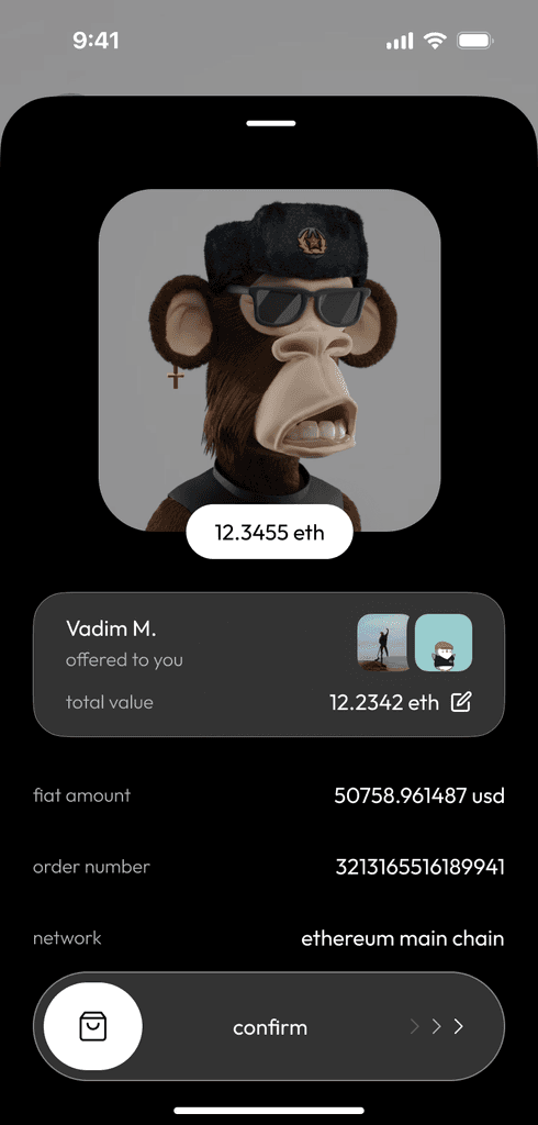
Redesigned for simplicity. Complete purchases in just four steps—making every interaction quick and effortless.